
After a whole heap of walking through the galleries and now having an extra day to play with, I decided it was going to be a early trip back to the hotel and some more quality time with the Jacuzzi tub in the room.
Between me and the blissfully warm water and the jets was a hour-long trip on the Silver line back to the Weihle-Reston East terminus.
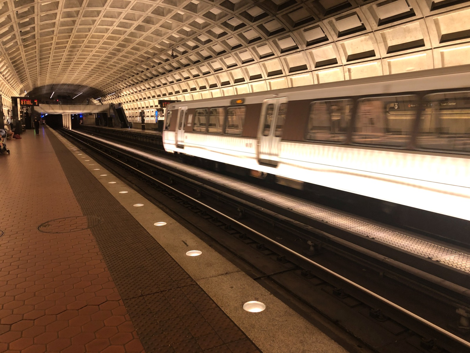
One thing that struck me as I was waiting on the platform was the uniformity of the design features of the underground stations in the Metro system.
The New York Subway prides itself on the incredible diversity of the underground stations, especially when it comes to the artistic touches on the walls. Honestly, I could spend a trip just riding the rails and photographing all of the mosaics in the various stations and study the differences in feel and design.
Part of that comes from the fact that the current New York Subway is an amalgamation of three different subway companies that have existed for over a century: the original Interborough Rapid Transit (IRT) which are the lines identified by numbers and operate in narrower older tunnels (to discourage train companies from running freight on the subway lines) that the wider and longer trains of the Brooklyn-Manhattan Transit (BMT) and Independent Subway (IND) (whose lines are identified by letters) cannot operate.
But the other thing is that the MTA has always encouraged arts in the subway and would commission dressing up the walls with murals and mosaics and other beautiful artistic touches in a fair amount of the stations. Even today, the arts are welcomed in the stations with buskers who are officially licenced by the MTA to perform on the platforms and entertain the passengers awaiting the trains.
By comparison, the original design criteria of WMATA was that the stations and platforms were to be as uniform as possible to reduce construction costs but also provide a consistent experience for the passengers. When you’re serving the city that’s home to the Federal government that prizes conformity and consistency above other considerations, it wasn’t too much of a surprise that WMATA would cater their design to uniformity.
It won’t matter which underground station you’re at…they all have the curved waffle-patterned ceilings, the red hexagonal tiles leading to a tactile patch before you get to the recessed platform lights that look like they’re encased in marble. Even if the station isn’t underground, the other platform features will be identical to any of the underground stations.
To be fair, Metro has done a good job with that station design and it’s actually very pleasing to the eye whilst remaining definitely functional and accessible.
It’s just amusing seeing yet another difference between the rather Bohemian New York City and the staid and steady Washington DC right down to their subway systems. 🙂


